Have you ever wondered why certain restaurants make your mouth water while you just walk past others? Or why you are more inclined to buy something in some stores than others? The answer may lie hidden in color psychology. In this blog, you'll discover how color psychology has been used in marketing for years and how you can use it to make your business more profitable.
If you have read our previous blog posts, you are probably aware that color is a fundamental element in the design of your menu and your business. No wonder, because color is one of the most powerful communication tools in marketing because it influences your mood, appetite, actions and reactions. Thus, color psychology has been used in marketing for years.
Moreover, there has also been a lot of research on colors and their influence on consumer behavior and decisions. What turns out? It's also very sector related. For example, what works for an insurance office does not directly do so for a restaurant. So as the owner or operator of a hospitality business, it is advisable to take a moment to delve into color psychology to discover what it can do for your business.
Because did you know that certain colors can trigger hunger? Make you stay longer in your establishment or even order more? Or just the other way around, colors can make people stop being hungry or get confused. We will be happy to tell you all about which colors suit your business best and how to use them in your menu.
So which colors are best to use for a hospitality business? That question cannot be answered unequivocally because it depends in part on what type of business you run. What works for one may not work for another. It all depends on the values you stand for, the feeling you want to create AND the type of products you serve. However, there are a few general "guidelines" you can follow.
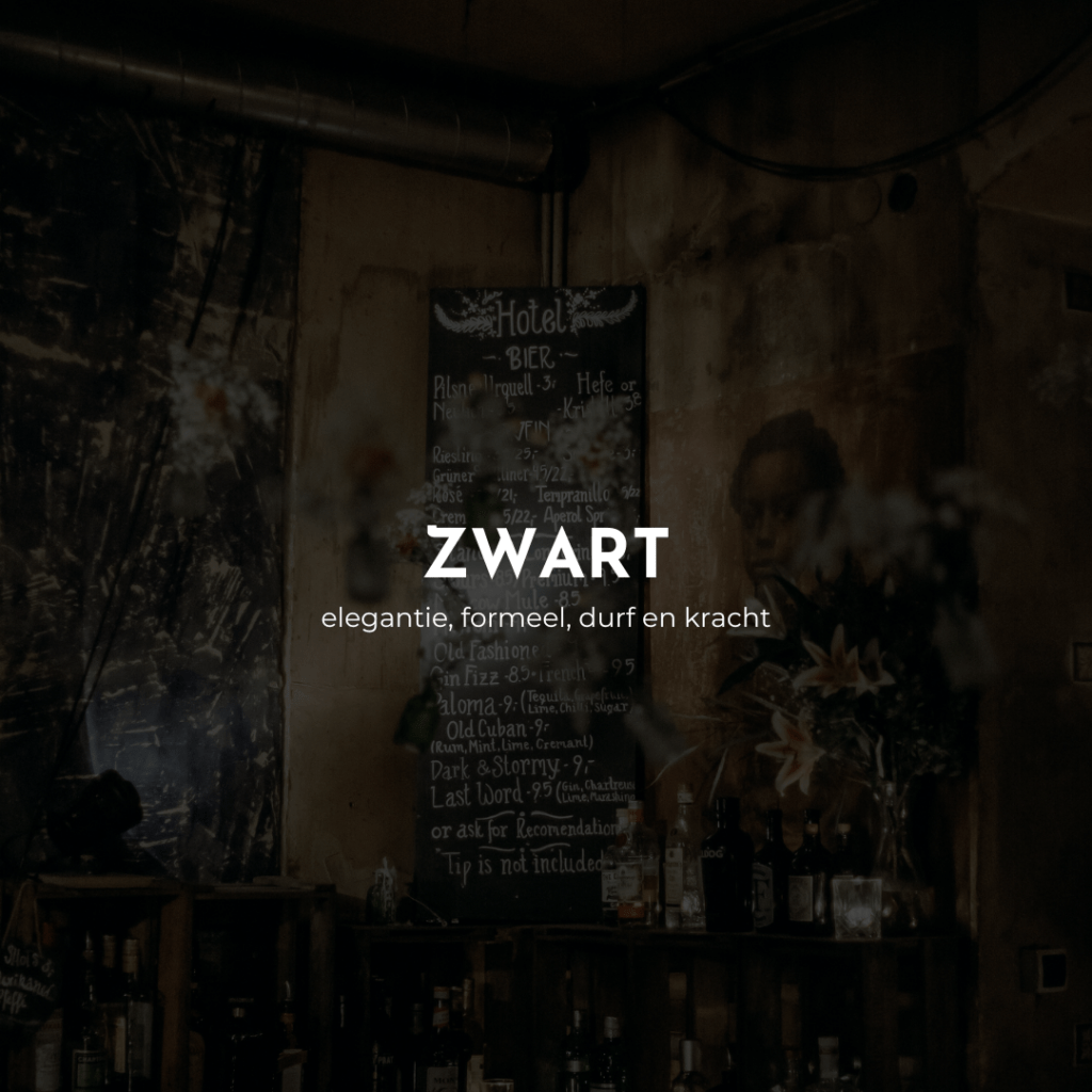
Keywords: Elegance, formal, boldness and power
Use in: Bars, nightclubs
Effect: Black generally represents a bit of mystery, but is also very elegant and formal, or just very cool. So by using a lot of black, you can make a striking statement. However, use the color sparingly, and mainly to make other colors stand out. Too much black can quickly make a space too dark or give the impression of being small. That won't make your customers feel good.
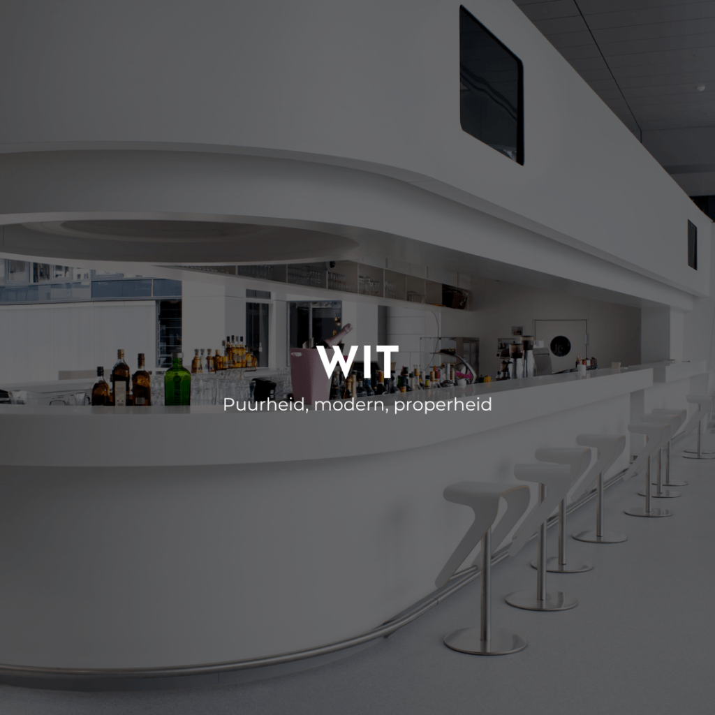
Keywords: Purity, modern, cleanliness
Use in: Small bistros, banquet halls and wedding halls
Effect: White generally provides peace and freedom. So that gives a lot of room to combine it with other, striking colors. It gives a very clean impression but should not come across as sterile. So make sure you have a good balance.
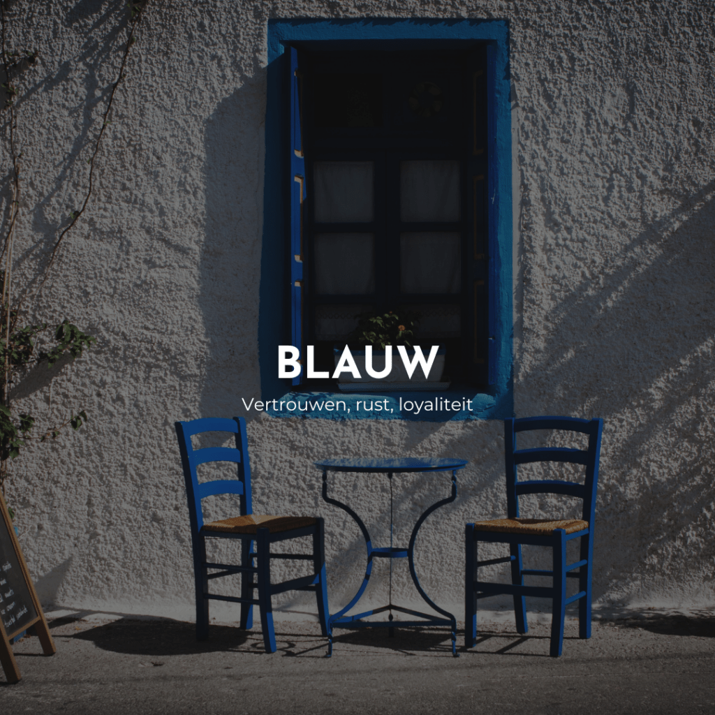
Keywords: Confidence, calm, loyalty
Use in: Coffee bars, cafes, nightclubs, maritime restaurants
Effect: Blue is first and foremost a color best avoided as a hospitality business owner. Why. This color is least found in nature. This can cause your customers to reduce their appetite or hunger. Your brain would create a natural aversion to protect you from eating something that would not be good for you. However, it may cause your customers to feel more thirsty, especially on a hot day. Just because it also reminds them of water. Sometimes, when used sparingly, it also works well for maritime restaurants.
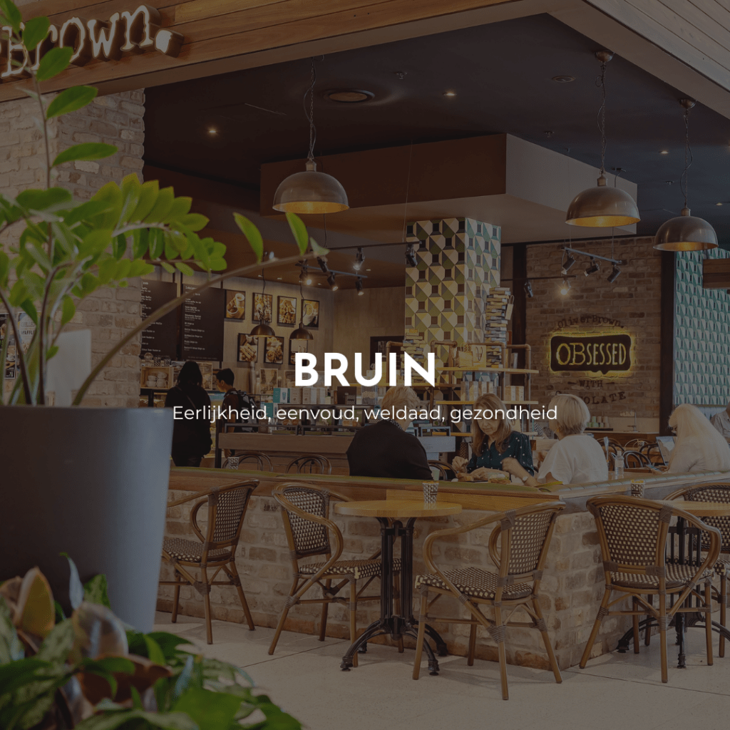
Keywords: Honesty, simplicity, wellness, health
Use in: Coffee bars, bistro, contemporary restaurants
Effect: Brown is a very earthy color that helps your guests relax and feel comfortable. Did you know that it can even provide a sense of support and stability? Thus, it encourages guests to return. Totally subconsciously!
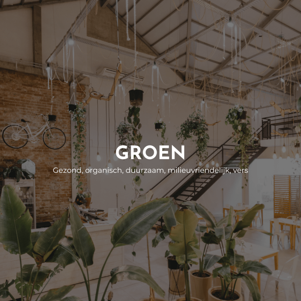
Keywords: Healthy, organic, sustainable, eco-friendly, fresh
Use in: Salad bars, healthy bistros and restaurants, veggie and vegan focus
Effect: Like brown, green is an earthy shade. So it is a very relaxing and comforting color. Because green is so common in nature, it is an excellent choice for businesses that serve healthy and natural foods.
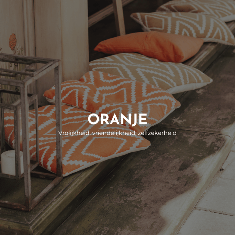
Keywords: Cheerfulness, friendliness, self-confidence
Use in: Fast food, ice cream parlor, casual atmosphere
Effect: The color orange makes you feel cheerful. So it is ideal for business with a casual, fun atmosphere. And just because it makes you feel so nice, it is ideal to use in business with less healthy food, because it makes people feel less guilty about what they eat. Thus, they are more likely to order more.
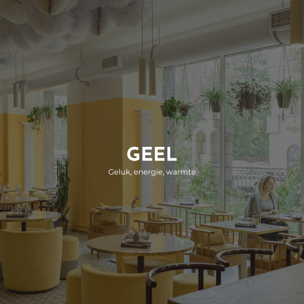
Keywords: Happiness, energy, warmth
Use in: Fast food, casual business, small bistros and cafes
Effect: Certain shades of yellow have an effect similar to orange. They make people happy and create an overall good feeling. Yellow is very vibrant and exciting, making it an ideal choice for stimulating environments. So watch out for a place where you just want to keep it very calm. Relaxation and yellow don't exactly go together!
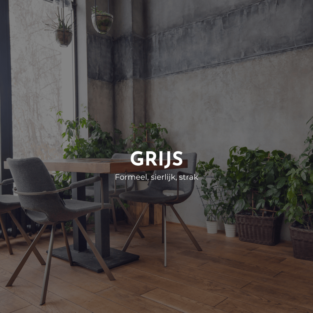
Keywords: Formal, graceful, sleek
Use in: Luxury brands, offices, interior design
Effect: Gray exudes neutrality and balance. It is used to convey a sense of sophistication and elegance. As a result, luxury brands and exclusive car dealerships often use this color to create a sense of prestige and quality. It also creates a timeless look and soothing ambiance. So this is a perfect color for a business that wants to exude pure elegance.
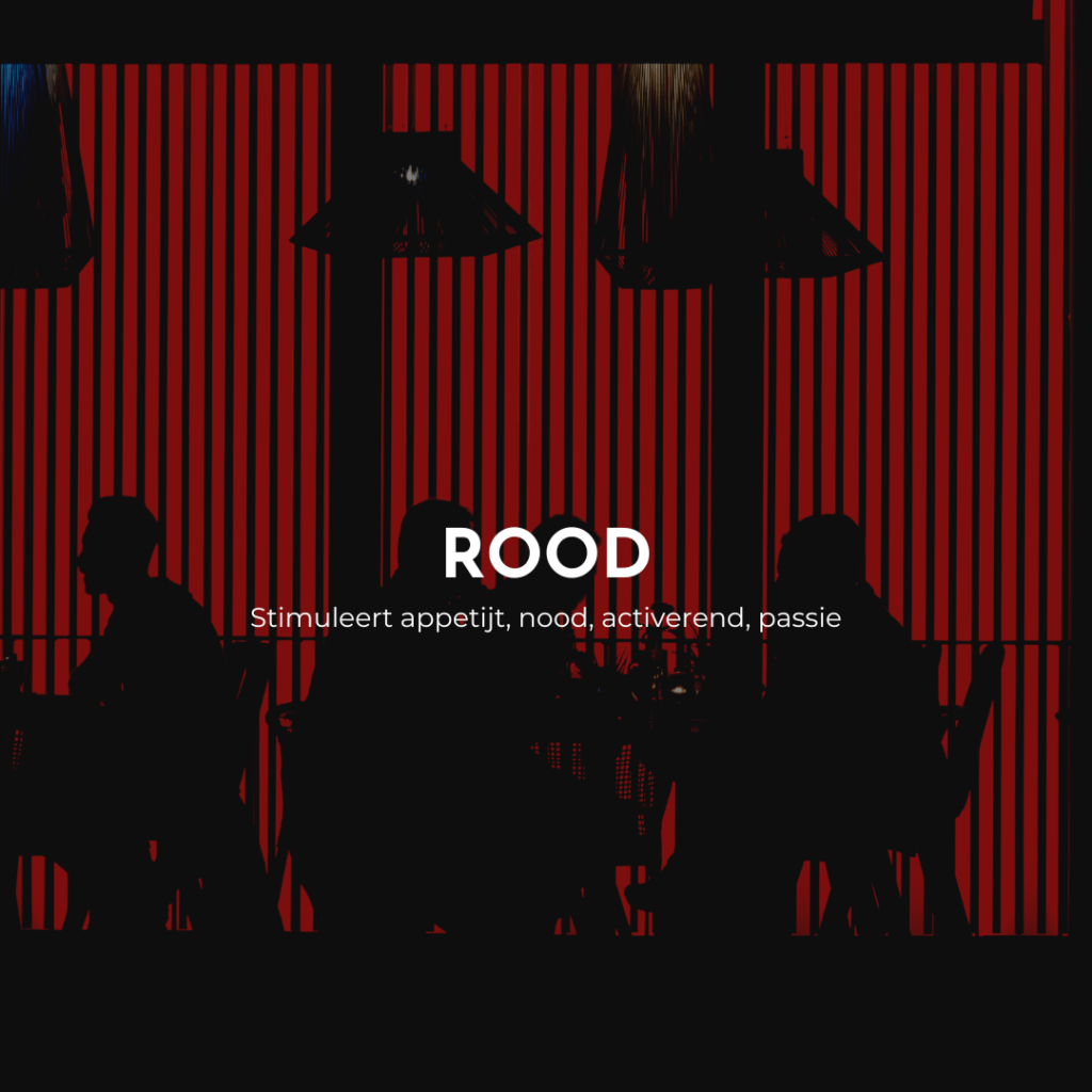
Keywords: Stimulates appetite, need, activating, passion
Use in: Fast food, high table turnover in a short time
Effect: Red can literally make your guests' hearts beat faster, causing them to become hungrier. It's a very activating color that makes people decide quickly, but also make them leave again quickly after they finish eating. This is important if you want to quickly fill the tables with new guests during a shift.
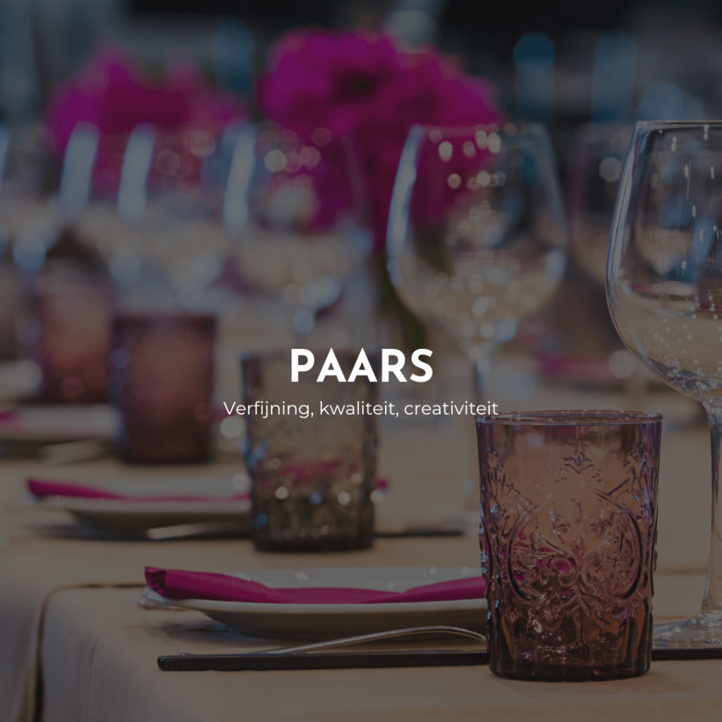
Keywords: Refinement, quality, creativity
Use in: Cosmetics, wellness centers, creative industries
Effect: The effect of purple on a business is going to appeal to consumers who are looking for luxury and creativity. The purple color is also going to create a relaxing atmosphere. In doing so, purple will also increase the perception of value, reinforcing the feeling of exclusivity and premium quality.
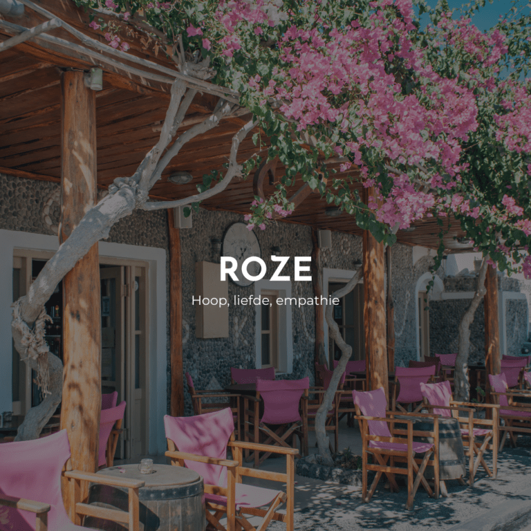
Keywords: Hope, love, empathy
Uses in: Children's wear, florists, beauty industry
Effect: Pink exudes softness, playfulness and romance. It appeals to emotions and can attract customers looking for a charming or romantic experience. So perfect for the ideal date night!
Not only in the interior and branding of your business is color important. It also affects your customers' behavior in your menu. So it is advisable to take this into account when you are creating your menu. To understand your customers better, you should also be aware of how the colors interact with your customers, their appetite and how it affects their choice. The step from the interior to your menu card is fortunately only a small one, as the same values always appear when it comes to menu colors. The bottom line is that you want to avoid unnatural colors, such as purple and blue, as much as possible. Instead, choose bright colors that stimulate your customers. While doing so, do keep in mind the type of business you have and exactly what result you want to get.
By working with color, you draw attention to certain items or categories on your menu. It is very smart to highlight high-margin dishes or drinks, or the items that you are very keen to sell for some other reason. Items with such a high margin are called Stars and Puzzles in the menu matrix. Ideally, use colors that stimulate hunger and speed up the decision process.
Learn more about the psychology of the menu in this blog.
In addition, you should always ensure the best possible balance. Don't cram your menu full of striking orange and red elements if that doesn't actually fit your business at all or your guests will be overwhelmed by the brightness of the combination.
Make sure that the colors interact harmoniously with each other and the interior, as well as that they match your business. For example, while blue is generally to be avoided, there are of course exceptions. Think of restaurants that serve a lot of fish, by the water. If you use the color sparingly and combine it with more neutral colors, it contributes to the overall atmosphere of your establishment.
Blue is also a smart choice for certain bars, for example, precisely because it can whet the appetite for drinking because of its link to water. Are you sitting on the sun-drenched terrace of a trendy summer bar? A lick of blue can then absolutely not hurt, on the contrary.
Does your business appeal mainly to children? Then unnatural colors are often a good choice, because these kinds of bright colors are also very playful. That fun, reckless feeling prevails more often with children than the instinctive aversion to unnatural colors. So go ahead in your candy store or ice cream parlor!
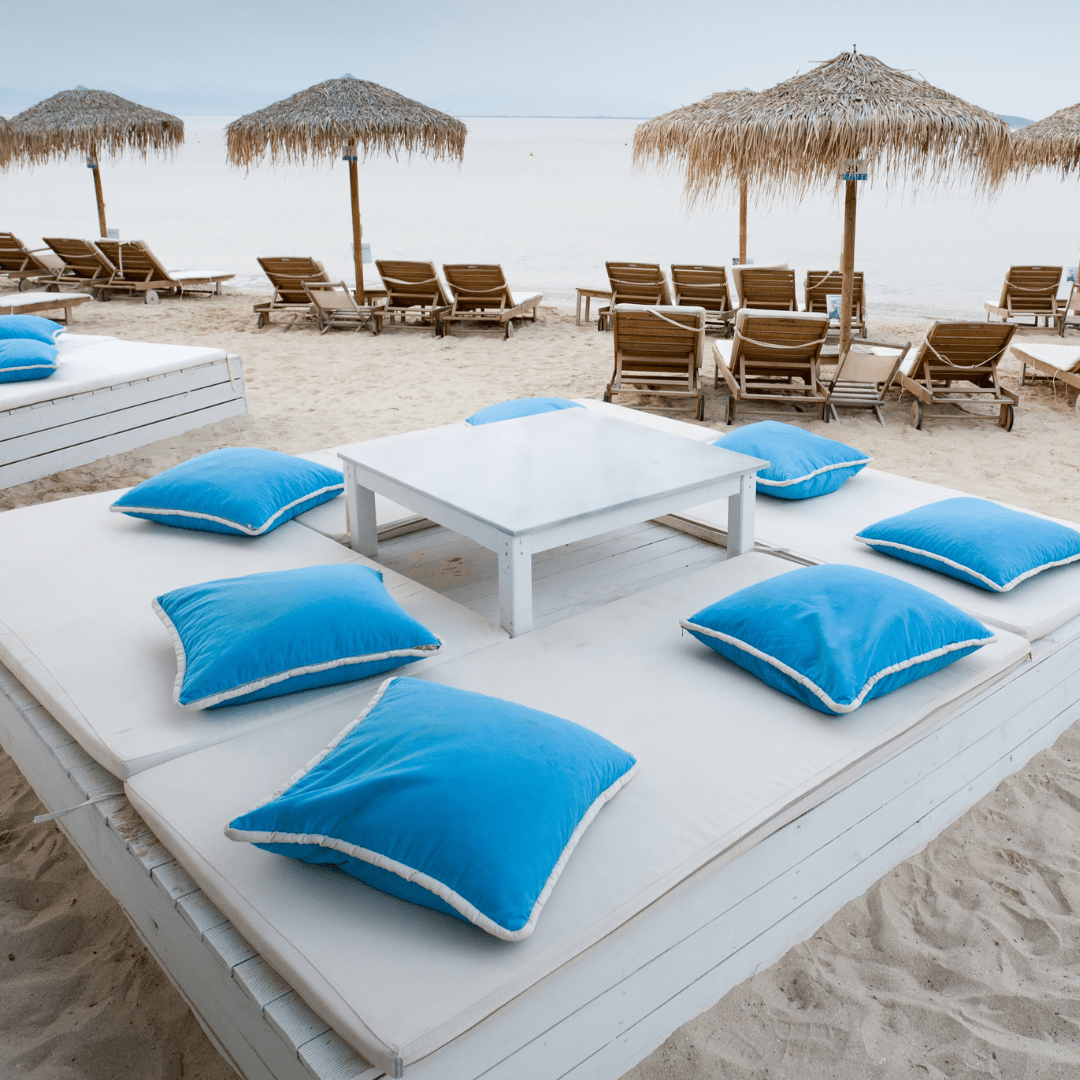
By consciously choosing the right colors in your interior design, branding and menu, you can create an atmosphere that suits your business and will attract customers. Color psychology is a valuable tool you can use to set your business apart from the competition and increase profitability. So get started and find out what colors best suit your business and how to use them effectively to achieve your goals.